Apixio
The unique challenge
As a global leader in healthcare technology, Apixio needed a website that would align with its tech-driven image while better achieving its goal of turning unusable data into actionable insights for patients.
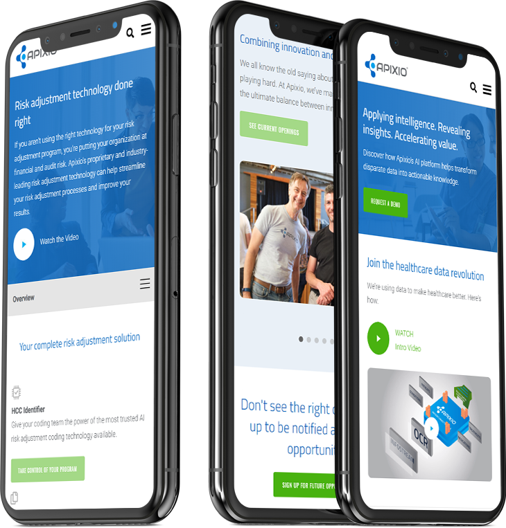
Apixio’s existing website delivered a poor user experience by failing to effectively educate visitors on the process of its platform and by conveying an image not in line with its objectives or range of capabilities.
-
01Craft a brand messaging strategy to turn technical language into digestible content
-
02Identify site goals, KPIs, and user personas
-
03Design a website to mirror the brand’s tech-driven platform
-
04Showcase platform process via graphic animations
-
05Make it easy to request a demo from any page on the site
-
06Integrate Eloqua and Salesforce
Proven Results
Strategy-Driven Content
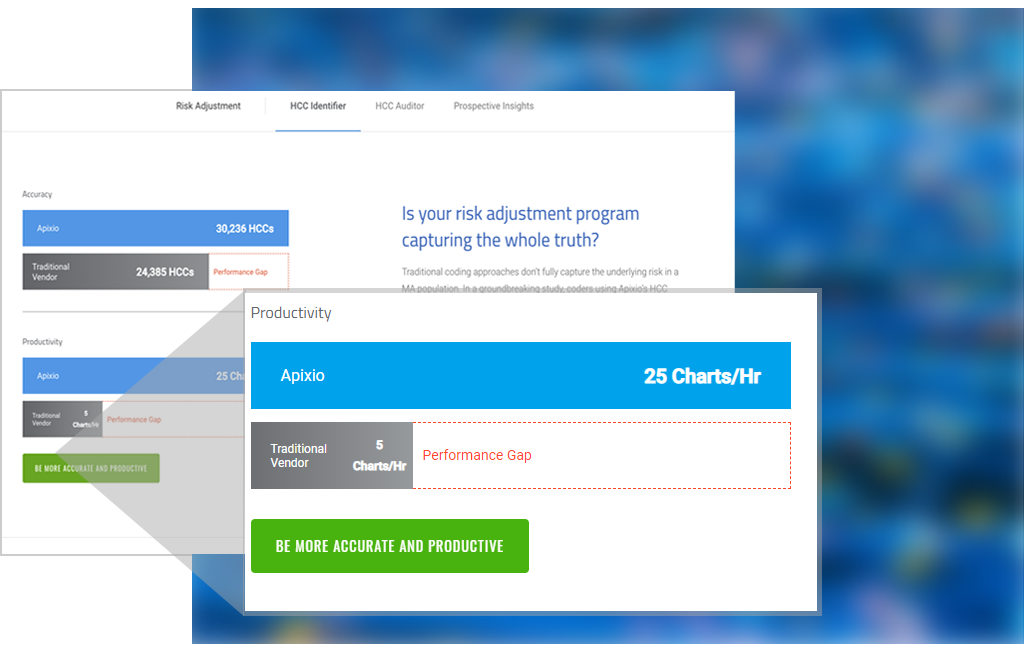
Apixio’s new site content engaged with users by leveraging a brand messaging strategy created in the early stages of the project. The primary goal of the messaging was to turn technical language and statistics into an easily digestible display of Apixio’s process. User personas were also developed to pinpoint the goals and habits of the site’s key visitors.
Design That Tells a Story
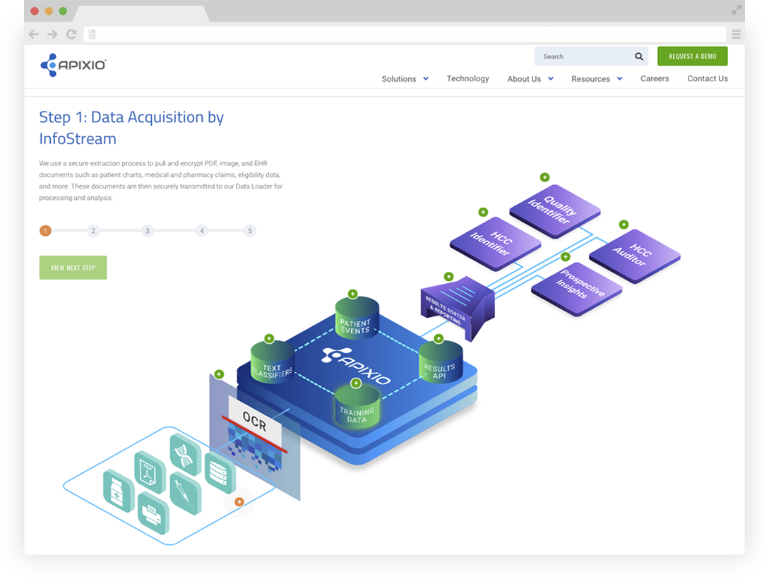
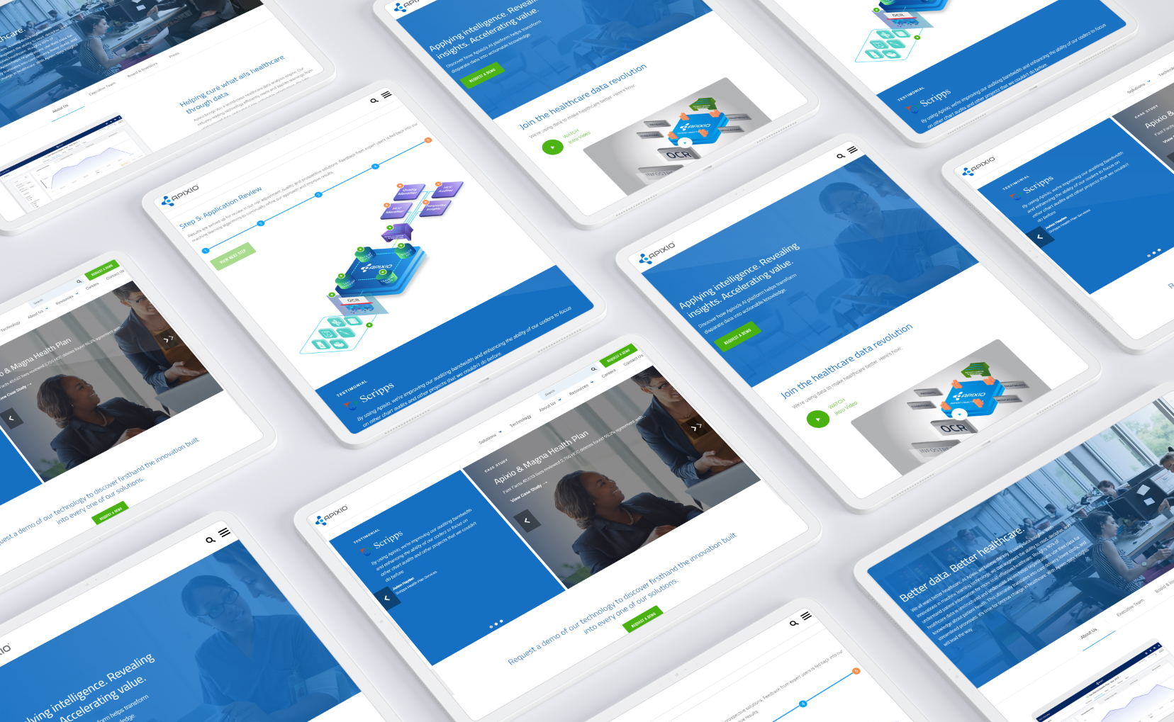
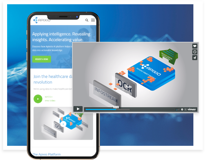
Conversions also saw a rapid spike following launch, as new functionality made it easy to request a demo of the Apixio platform from any page on the site. The new Technology page showcased the platform’s process by featuring five custom graphic animations that were also reworked into a single-panel display on the homepage. Eloqua and Salesforce integrations also served to streamline Apixio’s business processes in the backend.
