Trafera
The Unique Challenge
As the unification of two pre-existing brands – FireFly and Trinity3 – Trafera marked a new beginning in the world of educational technology. The entirely new brand faced the tall task of launching itself online and required a brand identity and website that would properly convey its message and purpose.
-
01Create a visual brand identity from the ground-up
-
02Creation of a new and unique logo, brand colors, fonts, iconography
-
03Craft website strategy to determine key performance indicators and corresponding page and content requirements
-
04Design and develop custom, mobile-friendly website that accurately conveys new Trafera brand and offering
-
05Execute entire project on an expedited, timeline from kickoff to launch
Proven Results


User-Driven Strategy
Before design and development could begin, Perrill first needed to establish the overarching website strategy by reviewing business objectives, defining the website’s role within them, and identifying user actions and key performance indicators. From there, Perrill created a visual representation of the sitemap that displayed the pages to be included and their hierarchy, as well as what content should be included on which pages. This involved an analysis of competitor and industry trends to help pinpoint best practices and user behaviors. Once finalized and approved, the website strategy set the roadmap for the remainder of the project.


A Brand is Born
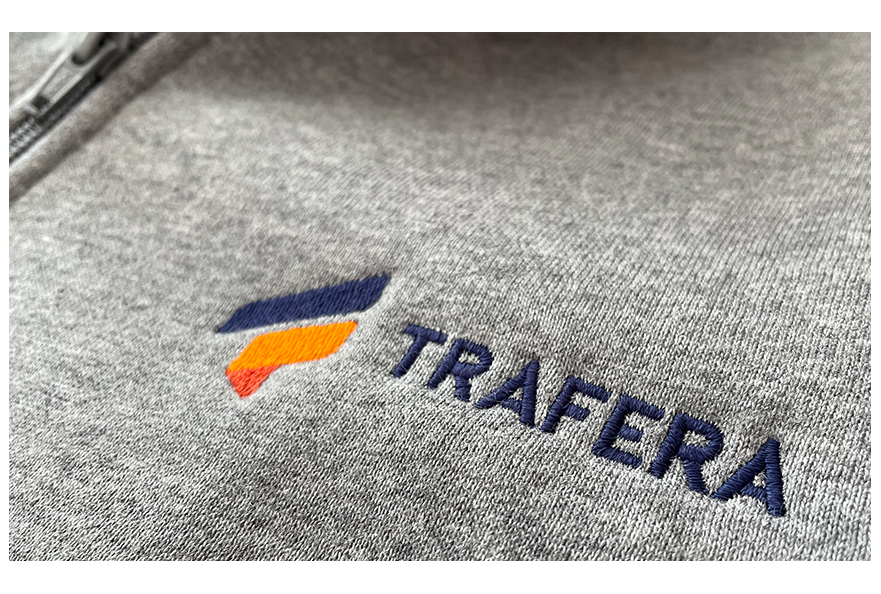
The merging of two pre-existing brands left the new Trafera brand in need of a whole new identity – something Perrill was excited to help build from the ground-up. Trafera’s new visual identity included the creation of a new logo, brand colorways, fonts, and iconography, in addition to competitive research against direct competition and related fields to gauge the existing landscape. Brand identity creation involved several rounds of concepting and review between Perrill and the client, resulting in a visual personality that perfectly encapsulates Trafera’s sensibilities and objectives.

Custom, Responsive Design
With the brand identity created and the website strategy set, Perrill moved forward designing and developing a fully custom website built to perform on any device. The website’s design put the brand identity in motion on a large scale for the first time ever, seamlessly aligning colors, fonts, and messaging all in one place. Development through WordPress ensured content and imagery were easy to manage for the client, and that they’d be able to scale the website as their brand and offering grew in the future. The result was a robust online resource where educators could gain access to digital lesson plans, classroom presentation and engagement tools, and everything else they need to ensure students are connected, staff are equipped, and needs are supported.
